
This week we'll take a look at a photo illustration,
and examine its construction from the initial concept,
to its production.
I like to do photo illustrations, but that said, I also
like to do a lot of things that I'm terrible at.
Some of these include:
-the banjo
-botany
-art
I'm not even going to talk about the banjo - I sound like
a street cat trapped in a chain link fence. My plants are
begging for hospice, and the only art I've ever pulled off
was a clay ashtray in 4th grade art class.
The ashtray was a wreck. It was orange and lumpy. Other
classmates got blue ribbons for theirs, and all I got was a
scratch and sniff sticker that said, "Keep Trying!"
Why we were told to make ashtrays, I have no idea, except
that my teacher smoked Pall Malls and she coughed a lot.
I liked her, though, and I like art in general. That's not the
problem - the real problem is I can't draw, I can't paint,
and I sure as hell can't sculpt.
Let's take a look at my art portfolio:
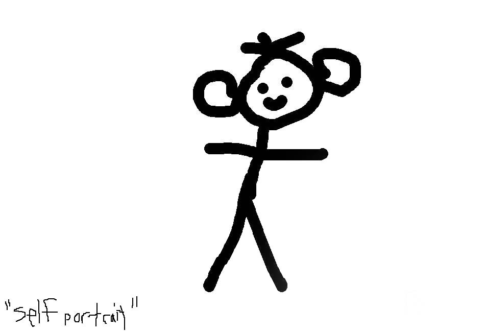
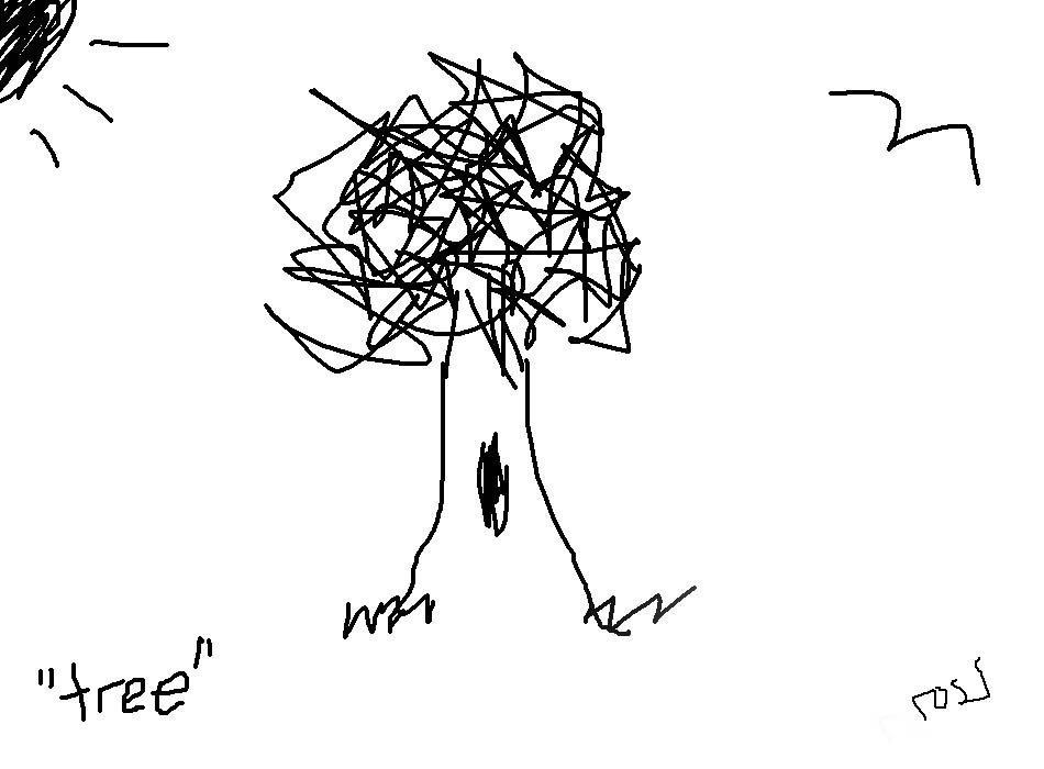
Just stunning.
SO, when I got the assignment to come up with a photo
illustration regarding picnic season, you can imagine
my panic.
Since I can't create anything, I have to rely on either pictures
I make, or stock images to create composites. We had a budget
of $75 dollars.
One of the things I always do is to create mockups with
low-res files from stock, then I show them to different people
in the office to get their reaction, before buying anything.
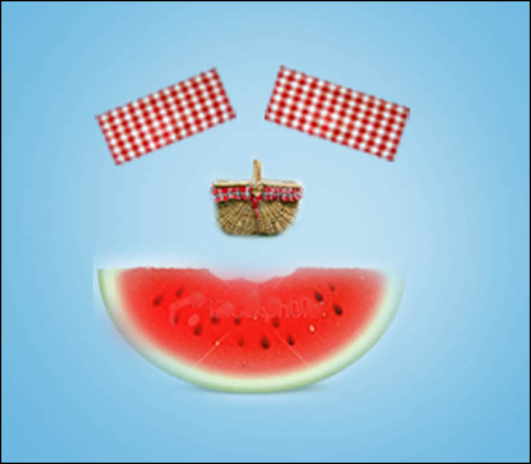
Here's one of the first images:
Just terrible.
It reminds me of tapioca, wicker chairs and fried chicken
steak at Cracker Barrel.
Out.
I tried working with something goofy next:
As if it wasn't already bad enough, I made it worse by trying to
make it better:
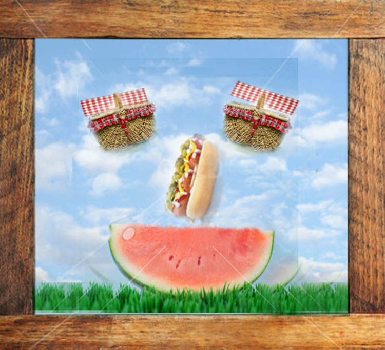
You know there's a problem when someone cringes,
and pats you on the shoulder. Sometimes you just
have to give up on an idea. My art teacher did the
same. I shrugged my shoulders, got some school
pizza, and regrouped.
While I do love school pizza, that's of no help to
us now.
When problem solving, it's helpful to include other people.
We held a meeting that included the editor of the section,
a designer, and one of our photo editors.
We kicked around and brainstormed for key words. This is
important for me because since I can't draw, if we had a key
driving word, perhaps we can use that as the driving force
of the visual.
The usual ideas came up:
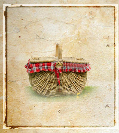
hot dogs, hamburgers, wine and of course a picnic basket
and a picnic blanket. We all agreed we wanted to stay away
from the traditional (expected) picture of a red and white
picnic blanket.
One of the designers mentioned ants and it clicked. I thought
we could make something whimsical with them, so I started
making rudimentary compositesusing stock images (I often
pull low-res images from stock files when doing mockups).
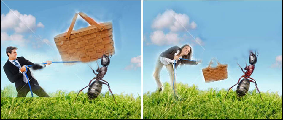
Nobody liked the idea of the ant fighting someone, but we did
like the ant. I purchased a stock file of an ant, and started over.
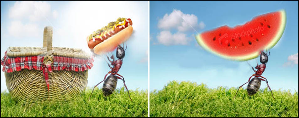
I did a few other mockups to see what might work - neither of
which I really liked - but I felt we were tapping into the right
spirit at least.
I felt we were getting closer, so with the remaining balance of
the budget, we purchased a few more stock pictures. I created
these mockups, and while not quite right, we were getting closer.

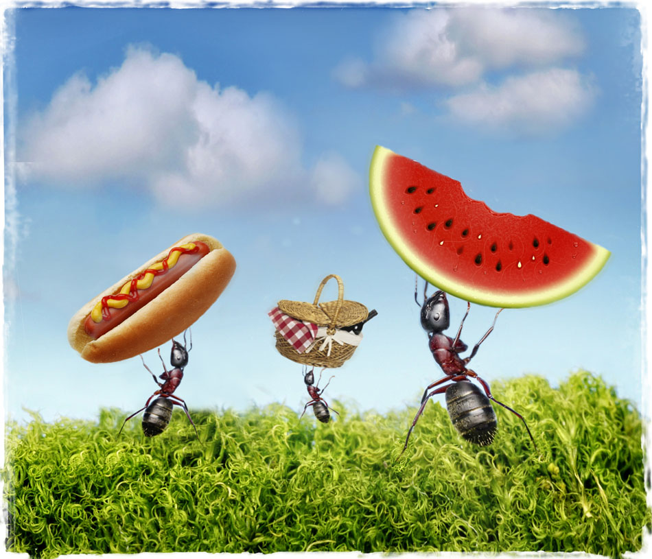
Finally we came up with this. We duplicated the ant, then
dropped in the symbols of the picnic. We used a number
of layers and masking, as well as creative construction of
the clouds. If you don't know much about layers and masks,
I encourage you to try. Knowing these two parameters opens
up a new world in Photoshop.
A friend of mine asked this, and I think it's worth pointing
out that I often use stock images when we don't have a lot
of time to shoot the assignment, as in this case. If you have
a budget of at least $100, it's usually enough to build a
composite. Sometimes it's a mixture of shooting and stock,
it just depends on timing usually.
In this case, it was the quickest and easiest route to use
stock images for this composite.
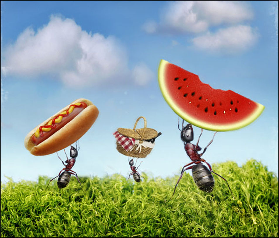
We roughed up the edges a little for a final touch.
I'm happy to help anyone who wants to learn more about layering,
or anything else I can offer about photo illustrations. I'm not the best
at them, but it is fun to try to expand yourself.
I found this tutorial awhile back which is great at giving an example
on how to grunge edges. It's worth a look.:
http://pshero.com/photoshop-tutorials/photo-effects/grunge-photo-edges
When you have an idea, work to simplify it and play off key words
to help you focus. Look at other websites for inspiration. There are
many, but here are two illustrators I admire who have newspaper
backgrounds:
http://www.andrealevy.com/
http://www.stephaniegracelim.com/
Their work is striking and worth studying.
+++++
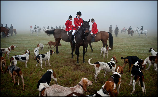
Next week we'll take a look at this fantastic image by
Andrew Craft:
As always, if you have a suggestion of someone, or an image you
want to know more about, contact Ross Taylor at: ross_taylor@hotmail.com.
For FAQ about the blog see here:
http://www.imagedeconstructed.com/
No comments:
Post a Comment